The Leaf, the Square, and the Story Behind Our Mark
An email interview with Monika, the artist who designed the logo of Peer Positive. We asked her about the ideas and inspiration behind the design.
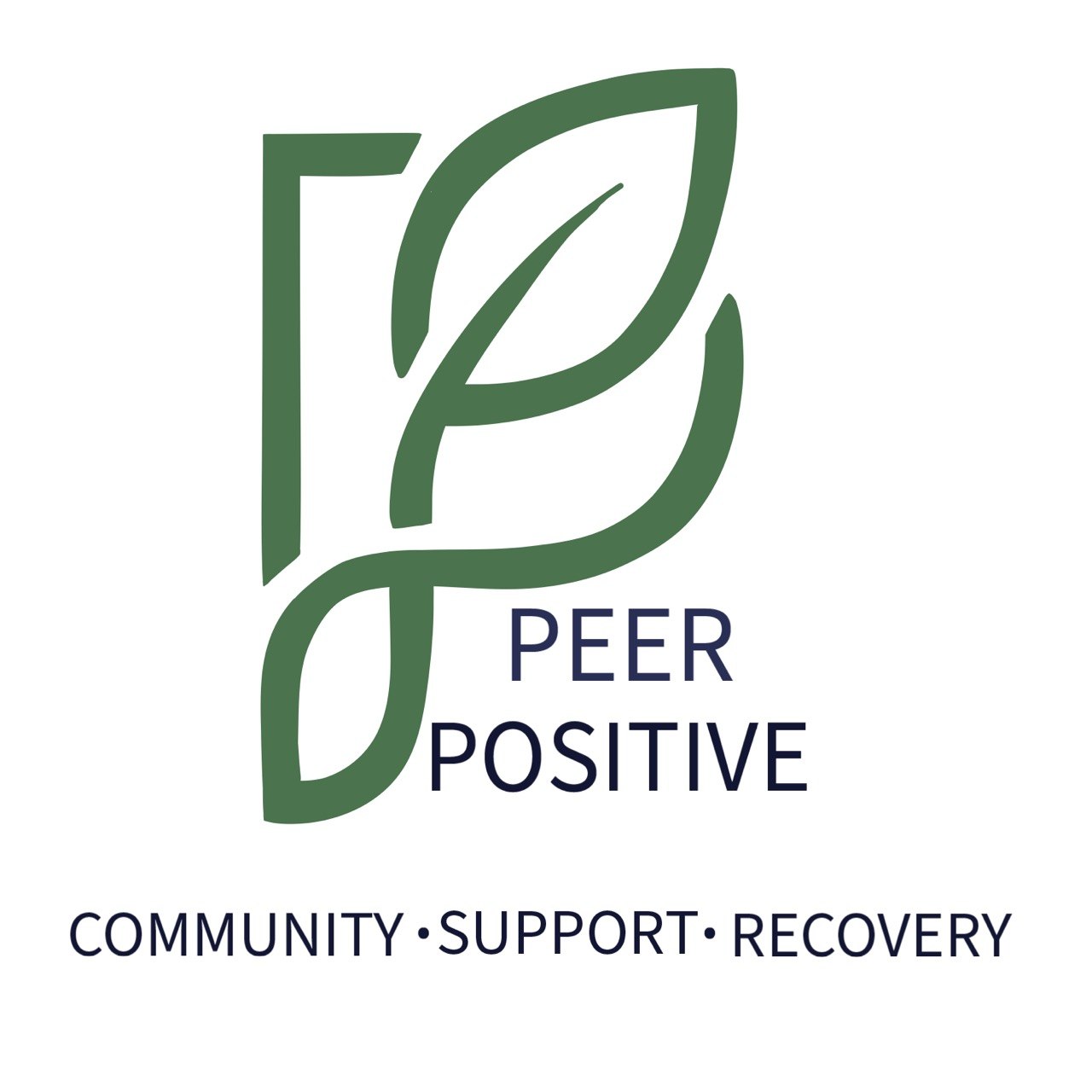
What does this logo mean to you?
To me, the logo reflects regeneration and growth. The leaf and the green colour instantly evoke a sense of healing, renewal, and life. The leaf breaking out of the square represents breaking free from the rigid, predefined paths of recovery that society often imposes.
And the gentle, flowing curves symbolize flexibility, freedom, and the very real non-linear journey of healing. It feels like a visual reminder that recovery doesn't have to follow strict lines; it can move, bend, and evolve in its own way.
Do you connect with the idea behind Peer Positive?
Yes, absolutely. I deeply resonate with the idea that the people around us — our chosen communities — play a crucial role in healing. Often the wounds and difficult experiences come from society and interpersonal interactions. So the presence of supportive people can make all the difference.
Sharing what we've been through, and listening to others' journeys, has a humanising and grounding impact. It reminds us that we are not uniquely burdened — many sensitive people experience similar struggles. This collective understanding can be comforting, empowering, and validating. It can also give us new ideas and approaches to explore, especially when we learn what has worked for others on their paths to recovery.
What were you thinking when you chose to draw this logo? How did the image come to mind? What does it represent?
When I began working on the design, I wanted it to reflect sensitivity, regeneration, and resilience. For me, healing is almost immediately associated with green, nature, and plants. Personally speaking, they hold a quiet symbolism of renewal.
At the same time, I didn't want to lose sight of the path-breaking nature of this initiative. Peer-supported healing, and moving beyond purely psychiatric-medication-based approaches, is powerful. That's why I included the rigid square: it represents the old, limiting structures. The leaf breaking through it signifies courage, possibility, and alternative pathways to recovery, ones shaped by community, autonomy, and compassion.
Please share a little about yourself, so we understand the person behind the image.
My name is Monika. I've always been a curious, sensitive, and creative person. I learned drawing and digital tools on my own, simply out of interest and exploration. Academically, I pursued a Bachelor's in Education, which played a big role in shaping my thinking and my sense of the world.
I love creating things that are beautiful and colourful. I feel most at home when I'm spending time in nature. Creativity, sensitivity, and learning have always been central parts of who I am.
The leaf breaking through it signifies courage, possibility, and alternative pathways to recovery — ones shaped by community, autonomy, and compassion.
Interview conducted by the Peer Positive team over email. Logo design and artwork by Monika.
More from the community.
Read about our purpose, meet the people behind Peer Positive, or share your own story.